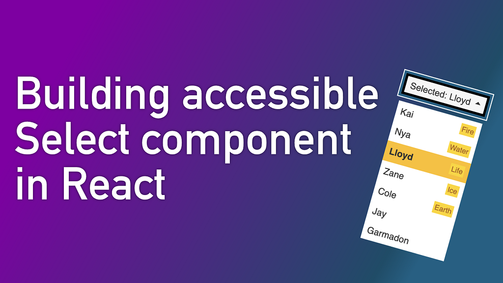
Select components are everywhere on the internet. The little dropdowns are the core of the web as we know it and have been with us since HTML 2.0 Specification was published in 1995.
As powerful as they are, their functionality is limited. They are unable to show pictures or other secondary data or get the list of its elements customised. In those cases, we might consider creating a custom element.
In this article I will walk you through the following topics:
- When should you think of implementing custom select and when you’re better off with the native one
- Why accessibility matters
- How to build accessible React components using ARIA properties and add a custom hook to handle keyboard navigation
- How to mimic select functionality
- How to mimic select keyboard events
- How to provide the best experience for users who prefer reduced motion
Should I build custom select?
In many cases, you might not need to build custom select. The native element allows for a lot of customisation so you can make it look consistent with your design. Many organisations have chosen to go the native route and opted in for default selects, including GOV.UK, SalesForce, IBM, Shopify. Check out their Design Systems to see how they managed to provide a consistent look while sticking to a native component.
In many cases, native dropdown might be a limiting solution though. You are restricted to the structure the select element provides. You cannot use images as options. You cannot add secondary information like extra tags adding more secondary information about each option.
In the case of our dropdown at the LEGO Group, we wanted to show extra secondary data like the label if the entry is new. Default select does not provide any mechanism to achieve that. We decided to implement select from scratch, keeping accessibility in mind in all the steps of the development journey.
Why accessibility?
There are many reasons why you should consider accessibility at every step of your process.
Disability is all around us
According to the World Report on Disability, 15% of the world's population lives with some sort of disability. Making your website non-accessible means turning 1 in 7 people down. On top of creating virtual barriers, you can lose potential customers too.
We all need some kind of accessibility
When talking about accessibility we might tend to think of people with permanent disabilities. But in reality majority of us already had or will experience some kind of temporary disability in our life. You might break your arm or leg and be incapacitated for a few months. You might get an eye infection and get temporarily blinded. You might stand too close to the audio equipment at the music gig and get short-term hearing problems.
A few years ago I was a victim of an accident that made me unable to use my arm for a month. During this time I resorted to accessibility features to be able to navigate quickly on the websites and continue doing my job. I described my experience in one of my past articles:
What I’ve learned from being a one-handed-engineer for a month
Contractual requirements
A more pragmatic reason is that there might be contractual requirements imposed on your organisation to make sure your web application is accessible.
In the US “Businesses that fall under ADA Title 1 or ADA Title 3 must have a website that gives ‘reasonable accessibility to people with disabilities.” [1].
European Union passed European Accessibility Act in 2019.
How to prepare accessible select?
Rules for creating accessible elements:
- Design and implement elements in a way that it’s clear what its function is — a dropdown should look like a dropdown, an input should look like input, etc.
- Make sure navigation can be done without using a mouse
- Make sure all elements are semantically correct
- Make sure to add proper aria attributes
- Test, test, test
Building the main scaffold
Before we start styling our components, we should build an accessible scaffold. Without that, adding accessibility later could be tricky.
Below is the basic structure we will be using:
Testing for accessibility
We did not add any accessibility features yet. If we try to enable VoiceOver and navigate to the button, it will be announced as a regular button. We need to specify what roles each of the elements has and how they relate to each other. We can do it using ARIA attributes.
ARIA stands for Accessible Rich Internet Applications and is a set of roles and attributes to make web applications more accessible for people with disabilities by adding meaning to the elements which otherwise have no meaning when used with accessible tools.
There are multiple tools to test accessibility. In this article, I will show 2 of them which were the most helpful for me: MacOS VoiceOver and Chrome Developer Tools Accessibility tab.
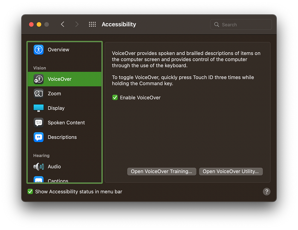
macOS VoiceOver
To turn on MacOS VoiceOver you can head to System Preferences → Accessibility → Vision → VoiceOver. From this window, you can also turn on Show Accessibility in menu bar for quick access.
If you are not working on macOS, there are equivalent tools available for other systems. Most Gnome-based distributions like Ubuntu comes with Orca Screen Reader which can be turned on in the settings. On Windows, you can turn on Narrator using Windows Key + Ctrl + Enter. You can also install free NVDA screen reader for Windows.
Chrome Developer Tools Accessibility Pane
A great tool to debug accessibility is Chrome Developer Tools Accessibility Pane. Once you open it and select an element to inspect, it will summarise all ARIA attributes and mark the ones which are invalid. It will also show you the accessibility tree which is used by screen readers to determine the structure of your website. Similar feature is available in Firefox Developer Tools.
Adding accessibility features
Once the VoiceOver is on, it will describe what’s currently focused on your website. If we focus on our button we will see that it’s identified as a button. In our case we want the button to represent a select. To do that we need to change its role. Before we start adding the roles, let’s learn (or refresh) what ARIA roles are:
“ARIA roles provide semantic meaning to content, allowing screen readers and other tools to present and support interaction with object in a way that is consistent with user expectations of that type of object.”
WAI-ARIA Roles — MDN Web Docs
In our case we need to use composite widget roles: our button should have the role of combobox representing an element that controls another one. It will be controlling our list of options which role can be defined as a listbox: representing lists from which users may select one (or more) items.
Each role determines the ARIA attributes the field requires to work properly. For our combobox, we need to define which element it controls, if the element is currently expanded and which descendant is currently active. To do that we can add the following properties:
For our list, we need to update its role and remote it from sequential keyboard tab navigation. We also mark it as not multi-selectable in our example. Here’s the documentation for all valid aria attributes for listbox.
Each of our list options should also get new attributes:
- role=optionto represent a valid option
- aria-selected for the currently selected option.
- id — to be able to identify them in the button’s aria_activedescendant.
You can find the list of valid aria attributes for role=option on MDN Web Docs.
Finally, we can use our new aria-* values to style our component:
By tying up aria properties with styles (instead of adding custom classes) we ensure that other developers will most likely keep the aria values up to date. Otherwise, an engineer who is not experienced with accessibility might forget to update those values when refactoring the component.
Below you can see the updated version:
If you run voiceOver and tab to the select element you will see it is now announced differently. Also, when hitting Enter the focus should switch to the currently selected element and this one should get announced too. Great job!
Accessibility differences between browsers
When adding accessibility features, it is vital to test it in as many browsers as possible. Even though there are standards in place, every browser behaves slightly different. Below are some of the observations I’ve made along the way:
- Chrome seems to be the most forgiving of the browsers, it is great for users, but, as a developer you should not rely the results it gives you to judge if the feature is accessible on other browsers.
- For accessibility to work on Firefox, the target listbox cannot be hidden from Aria tree at any time — make sure you do not apply aria-hidden or display: none for it, rather hide it visually, for example by making container 0 by 0 px with overflow: hidden.
- Safari has a bug (in the time of writing, August 2022) which makes listbox not being announced unless you focus it manually. This bug breaks a lot of otherwise accessible select elements showcased online, including official W3C ARIA example. This can be fixed by ensuring proper focus when opening dropdown on Safari:
This shows how crucial it is to test accessibility of your application in as many browsers as possible.
Adding mouse interactivity
Now we need to add interactivity to our elements. Because we use labels and radio elements all that we need to do is to add an onChange handler to allow users to select it.
We should also add a new state to capture which element the user is hovering on. Thanks to that we can update our aria-selected to update screen readers about the current selection.
You can check the working demo for this step here:
Adding keyboard interactivity
Next, we can handle keyboard navigation. We should provide exactly the same experience as a user would have had when using a native select element. Most notably:
When select is open you should be able to:
- Move up and down using ArrowUp and ArrowDown.
- Select an element by pressing either Space or Enter
- Collapse dropdown without selecting by pressing Escape
- Move to the first element by pressing PageUp or Home
- Move to the last element by pressing PageDown or End
When select is closed you should be able to:
- Open it by pressing either Enter, Space, ArrowUp or ArrowDown
To achieve that we can create a custom hook that will register proper events. We can also move all our state management code to this hook so it is easily testable.
The most important part in the code above for keyboard handling is done in useEffect. Depending on the dropdown state we either register our handlers for open dropdown or for closed dropdown. The handlers are as follows:
When dropdown is closed we open it by using ArrowUp, ArrowDown, Space or Enter.
To deal with an open state we need to add a bit more logic:
The code above should handle properly all common select use cases.
Below is an updated version:
Styling component
Almost all accessible functionality is done. Now we can style our component to look like an actual dropdown. We can also add some functionality that we wouldn’t be able otherwise: in our case, we will add extra tags providing additional information about the entries:

We can also add extra information for people using accessive technology: they might not be able to determine the role of our tags. We can add an extra description for them that will be read out by the VoiceOver so they know those are labels:
We can also add animation to make the component feel like the dropdown actually “drops” from the button. To do so we can use scale transformation to achieve a snappy result:
You can check the final version below:
Extra enhancements
The dropdown is almost done but there are 2 extra enhancements we could make:
- Closing dropdown when clicking outside it
- Respecting prefers-reduced-motion setting
Closing dropdown when clicking outside
If you click outside the dropdown it does not collapse. We need to add custom code to allow for that. We cannot use onBlur button callback directly. If you try to click on an option the blur makes the dropdown collapse right away and not select the option. Also for Safari we need to manually change our blur making this not a viable option. To achieve it in a more reliable way we should distinguish if the user clicked within our select element or outside it.
We can add a new handler when the dropdown is open and inspect every click performed on the page. The click event contains a target which determines the element that the user clicked on. If they clicked within our select element, one of its parents will be the root of our dropdown. To do so we can use Event.composedPath() that returns an array of elements the event will travel up the tree through. By marking our root with data-namespace attribute we can detect it and not cancel the event in that case.
Adapting to prefers-reduced-motion
Our dropdown has now an animation that plays when dropdown is opening or closing. Unfortunately, this sort of movement can be problematic for some of our users, for example, those with vestibular motion disorder. Luckily, they can set their systems and browser settings to indicate that they prefer reduced motion. It is still up to developers though to respect this setting and provide reduced animations.
Fortunately detecting prefers-reduced-motion is easy. We can disable transition for users who prefers it:
It’s that easy!
The additional benefit of providing a reduced motion version is that you can use it in your Cypress tests to reduce flakiness. Animations might make elements appear as visible when they should no longer be. To enable it when running cypress you can add --force-prefers-reduced-motion flag to your browser config.
To test it we can either enable it in our system or emulate it in Chrome by pressing the shortcut combination and searching for “Emulate CSS: prefers-reduced-motion: reduced”.

See the final version below:
What’s your main takeaway from this tutorial? Will your next Select component be custom or will you resort to native select? Let us know in the comments your thoughts!
Building accessible Select component in React was originally published in Engineers @ The LEGO Group on Medium, where people are continuing the conversation by highlighting and responding to this story.